Saturday, 10 May 2014

Improving functionality

Introduction

In this section of my blog, I will be describing how a scripting language can improve the functionality of a website. I will also include a comparison of the advantages of client side scripting to server side scripting. Description of how client side scripting can improve the user experience and form validation will also be included in this section of my blog.

Client side scripting vs Server side scripting

Javascript is proven to be the best client side scripting language for a number of reasons, one of which is the fact it's supported by almost all browsers, however older versions of Internet Explorer do not fully or support all of its features and functions. 

The two environments that can run scripts are Client side and Server side. There are a number of reasons and facts as to why client side scripting is better than server side. 

One of the greatest advantages of client side scripting over server side is that a website's script is executed much faster, because the connection to a web server, which contains a website's script is no longer necessary, because it is now being executed on the client side via their browser.

Furthermore, client side scripting allows better interactivity by responding instantly to user's actions, whereas with server side scripting the response takes longer and may suffer delays due to issues relating to the web server such as connection problems.

Due to the way dynamic scripts operate, if they are run on the server side there's a higher risk of hackers being able to gain access to those servers exploiting code flaws. In comparison, if such scripts are run on the client side, the risk is lower, because the client would not actually have access to the script itself, because all they do is enable the script to be executed in their browser.

UX - User Experience

Since client side scripting is executed on the user's browser, it allows for the creation of faster and more responsive web applications. Web applications are applications, which use a web browser e.g. Google Chrome as a client. An example of Javascript web application is 'Go', which is a board game for two players.   This means that client side script will run such applications more efficiently, which therefore improves user experience.


Furthermore, scripting can be used through a user interface. We know that a client side scripting enables the script of a website to be executed within a user's browser, however different users have different computer configurations e.g. larger or smaller monitors resulting in higher or lower resolution and size. Thus, the user interface automatically resizes parts of a webpage (e.g. boxes) in order to make it fit correctly in accordance with the user's configuration and settings. This affects user experience in a positive way.

Client side scripting affects the overall performance and responsiveness of web applications by improving them, but it also affects the responsiveness and performance of actions and functions carried out by the user. For example, when you hover over a text link in Amazon, you instantly receive a response, which could come in the form of a drop down menu/box.


Validation

In the past client side scripting was mainly used for validation purposes due to the effectiveness and convenience for users. If a webpage's script is executed on the client side and a user attempts to enter an input, it's being automatically validated on the client side, which saves time as otherwise the user would have to wait for the web server's response, whereas now they would receive an immediate response. Client side validation could help avoid potential errors, that may occur when input is sent to a web server to be further processed and validated. Therefore, this feature improves user experience by responding quickly at the user level.

For example, when you attempt to sign in on Amazon, you are prompted to input your e-mail address and password. If you input your e-mail, but accidentally forget to input your password and you click on the sign in button, you will receive an immediate response (error) saying that you need to input your password. This is one of the benefits to client side scripting related to form validation.


Additionally, the immediate response received from client side validation benefits from simple, yet highly effective error recovery mechanism, which identifies the areas/fields of invalid input and provides the user with appropriate, yet short level of guidance and assistance. Moreover, if user's input is valid, they will often receive immediate response that notifies them about correctly input data. 

For example, registration forms require a user name and/or e-mail and a password, which must be entered twice to ensure no mistakes have been made. Depending on the structure and design of the website, the client side scripting would often provide an immediate response as to whether the passwords match in the form of a simple green tick or red cross next to the input boxes.

References:

What are the disadvantages of server side scripting, 10/05/2014, http://bit.ly/SLXjDk

How to with PHP, 10/05/2014, http://bit.ly/RyiKqi

Advantages and Disadvantages of a client side programming language, 10/05/2014, http://bit.ly/1obznG7

Why do we need client side scripting language?, 10/05/2014, http://bit.ly/1mzdgd6

Client side vs Server side validation, 10/05/2014, http://bit.ly/1ldG5bh

User input validation, server side or client side, 10/05/2014, http://bit.ly/RylljO

Client side scripting, 10/05/2014, http://bit.ly/SF1d0J

Sample Web Apps, 13/05/2014, http://bit.ly/1g4drtU


Monday, 5 May 2014

Javascript & jQuery Fundamentals

In this section of my blog, I will be describing two key tools of web development.I will describe the purpose and function of Javascript and state its key features. Further in this section I will describe the purpose and function of jQuery.

Properly constructed web pages are built using up to three different languages one of which is often Javascript. The main purpose of Javascript is to command the browser on what to do e.g. display content in specific order. Javascript is a dynamic programming language. It's called dynamic because it adds features to web pages, which move or involve some sort of interaction or animation. The purpose of using dynamic language to built up a website is to make it respond to user's input and actions. It resembles the real analogue world, us the people live in.

For example, when you attempt to push or pull something it responds in a way known to us as movement, it works the same way in web sites. For example, when you hover over a button on a webpage the title of the button becomes highlighted, underlined or a drop down menu comes off it, which purpose is to give the user a response and let them know that something is happening, otherwise the user could think that they are not doing something correctly or the webpage is not working. 

Some of the key features of Javascript include:

  • The ability to detect user's browser, OS, screen size - this feature allows the webpage you're trying to load up appear in the most appropriate and functional way depending on different systems and platforms. 
  • Gives the user more control over the browser - Depending on how a website is written and scripted in Javascript the user could be able to change the background colour of the page and text to their preferences.
  • Validating user's input - This feature makes a webpage check for validation on the way (as the user is performing various actions). Validation check could be used on functions where the user needs to enter specific input e.g. numbers, letters and formats. This feature saves the user time by responding with an instant message of error, whereas if the input information has to be validated on the server, the user would have to wait for the server's response.
  • Javascript is executed on the client side - This is a feature that distinguishes Javascript from other scripting languages. Instead of a web page having to load up its content from the server it's running/kept on the code is being executed on the user's processor, which again saves time.

jQuery is like add-on to Javascript. jQuery was not developed alongside Javascript for the first time, but it was developed later on after programmers realising it's very time consuming to write the code for a webpage every time, even when the code repeats. Thus jQuery was created, which is an extensive library of Javascript functions/code and allows for the easier and quicker creation of webpages. 

Most of the pre-existing functions/code are free and available in jQuery, which is why it's a web development tool no programmer attempts to write a website without. jQuery is very easy to implement and it could add great functions and features to any webpage.

References:

JAVASCRIPT: ADVANTAGES AND DISADVANTAGES, 05/05/2014, http://bit.ly/1rWUGsu

THE PURPOSE OF JAVASCRIPT, 05/05/2014, http://bit.ly/1mwuF6f

jQUERY INTRODUCTION, 05/05/2014, http://bit.ly/1narfCX

jQUERY FUNDAMENTALS, 05/05/2014, http://bit.ly/1g3FRPp


Tuesday, 4 February 2014

Design Tools

Introduction

In this blog entry, I will be describing the main design tools that I have used to produce the design for my website. The tools I have used and I will be describing are:

  • QSEE Superlite
  • Colour Palette
  • Fonts
  • Wireframe
Another tool I haven't used yet, but will be describing is a Graphic Programme.


QSEE Superlite

QSEE Superlite is an integrated modelling tool, which supports variety of modelling techniques and is mainly used for producing different types of models and diagrams. Using QSEE Superlite you can create and maintain the following models: Network Chart, Structure Chart, Decision Tree and more. 

QSEE Superlite may come handy in different situations especially when you need to create a navigation for a website. This tool is very simple and easy to use, which means anyone can produce at least a simple navigation for their website. The software has limited number of tools within itself, however they are more than enough to create an understandable and helpful navigation or model. 

It's useful to produce navigation for a website, because in industry, if you are given a job to create a website, you must also create a navigation map. This navigation map will be presented to the client/s or people who have asked you to create the website, so that they get a better understanding of how the website will operate and navigate. This map could also be given to the users of the website, who may have very little knowledge about computers and websites specifically. This way they will know, which button will take them where and the overall link between pages.

Colour Palette

In order to generate the colour palette/scheme, I will be using in my website I decided to use the Adobe Kuler Colour wheel tool. The reason for choosing to use this tool is because of its simplicity and user friendly interface. 

Adobe Kuler is an online colour scheme tool. The way it works is as follows. Once you have entered the website, you will be presented with a circle containing many different shades and hues of colours. You can the use and drag the 4 points located inside the circle to find the colour that best suits your needs. 

Additionally, as you move each point within the circle, underneath it are different columns corresponding to the different points. They give you a better view and understanding of the colour you have selected, as well as information such as the RGB (Red, Green, Blue) and HEX values you will need when applying the colour in your CSS sheet.

Furthermore, to the side of the colour circle there's a colour rule tab, from which you can select the type of colours you are looking for. For example, if you are looking for colours that contrast each other you will need to select Complementary.

There are also themes created by other people that you can explore and choose from.


Fonts

I had access to variety of fonts tools, from which I could choose the fonts I will be using in my website. After viewing number of them including Adobe Edge Web fonts and Google Web Fonts, I've decided to choose two fronts from the Google Web Fonts tool.

Google Web Fonts consists of hundreds of fonts for different purposes such as headings, sub headings, body text and more. You can add any combination of fonts to a collection, which you can then preview one by one either in a short sentence, word or a whole paragraph. This feature will give you an idea of what the text and paragraphs in your website will look like. You are also able to type in your own text (text you may actually want to use in your website) and see exactly what it would look like in the font style you have chosen.

This tool consists of multiple filter options such as thickness and width and preview options such as font size.

Furthermore, if you attempt to use a specific font you will be given the standard (HTML), @import and Javascript code for the font to place in your web development software.

Wireframe

The purpose of wire framing is to give you or the client a rough understanding and idea of what the website will look like, once it's finished. 

Wire framing also gives the web developer a design or plan, which they should follow to ensure clients' or their own needs are met. Wire framing software consist of common tools such as text boxes/columns, images, navigation bar and other elements used in a website, which you can place and position according to clients' needs or your own preferences.

The structure and layout of a completed website should be as close as possible to the wireframe design created in the first place.

The wireframe tool I've used for my website is Lumzy. It is a free, online and pretty straightforward tool to use, which consists of most common elements found on a website such as navigation bar, images and text columns. 

By simply dragging and placing an element from the tab on the right hand side onto your page, you begin to create the design for your website. You can also import your own images in order to make the design/plan even clearer and more professional.

There are multiple features and functions within this online tool, which allow you to get as real first impression of your website as possible. The simulate feature allows you to preview your website design, as if it actually is completed and working.

You can also save the design/plan at any point by registering for free and you can come back to it to edit or carry on with it.


Graphic Programme

The purpose of a graphic programme is to enable a person to manipulate visual images. The two main types of graphics are raster and vector graphics. These are the graphics seen on websites.

Graphic programme is important when it comes to web development. Any website has images of some sort on it. One type of graphics any website has is a logo. Every logo created must be a vector, which enables scaling with no quality loss. 

Since websites are restricted in terms of space, image size is very important and must be considered thoroughly. Image size also impacts the time, it will take individual users to load up a website. Effectively, the more images you have on your website the longer it will take a user to load up your website/webpage.

This is why it's very important to keep the size of all your images to a minimum, so this will impact your web space and their loading time in a positive way.

Most graphic programs have the ability to import or export multiple graphics file formats. This is also very important when it comes to web development. This is because different file formats have different size and browser compatibility issues. 

For example, old browsers may struggle or even not be able to load images in PNG format. GIF images on the other hand support transparency, which could be a requirement for a specific website, as you or a client may want to have an image on its own (without white space around it) behind a text.


Wednesday, 8 January 2014

Assignment 2 - Design a Website

Introduction

My website will be about a motorcycle. More specifically it will be about Honda CBR 125R. It will consist of basic description and information that the audience may find useful.


Purpose

The purpose of this website is to inform the audience about the parts, models and overall different aspects of the Honda CBR 125R. This way the audience may learn about certain aspects of the bike and eventually apply the knowledge gained to their own bike.

Audience

The audience of this website are bike riders and fans. The website will be rather aimed at Honda CBR 125R bike riders, however it may also be appealing to other bike riders. The age range of the audience will be 14+, since it will contain information about the bike's maintenance and parts, which younger users will probably be not aware of.

Content - Description of Honda CBR 125R

This first page will be describing the Honda CBR 125R. The description will consist of basic information such as the first model, horse power, engine size and other relevant specification of the motorcycle.

Content - Honda CBR 125R Models & Year

The next one will include the different Honda CBR 125R models and their corresponding year of manufacture. This page will also include the relationship between the models produced during the years to other motorcycles. Additionally, I will talk about how the bike has developed and changed over the years and compare the basic specification of the bike.

Content - Accessories

The third page will consist of the different and relevant accessories for Honda CBR 125R. This would include things like exhausts, cargo net, outdoor covers, rim tapes etc and reasonable price of each product.

Content - Basic maintenance

The next page will contain information about basic maintenance. This would include things like changing/adding engine, brake and other essential fluids and oils. This page will also include "Always check before a journey" topic.

Content - Basic parts

The last fifth page will consist of all basic and essential parts. This would include things like tires, brake disks & pads, chain & sprockets and more. I will also include the price of the parts I talk about, to give my audience an idea of the cost of different products in case they decide to purchase any of them.

Navigation


The diagram above shows the navigation map of my website. The home page, which is Description of Honda CBR 125R is linked to all other pages. Note that there's also a link between the individual pages e.g. the Accessories page is linked to the Basic parts page, however the 'arrow (link)' cannot be shown in the diagram. This means that you can access any of the pages of the website from the page you are currently on. For example, you can access the Accessories page from the Home page, as you can access the Home page from the Accessories page. The purpose of this navigation map is to demonstrate how the pages are linked and work together to make it easier for the user to access the website and navigate through it at all times.

Colour Scheme


By exploring the Adobe Kuler colour themes, I managed to choose a colour theme I believe will suit my website. The colour scheme I will be using is complementary, which means the colours in the scheme are contrasting with each other.

The colours of the scheme are as follow:
Colour 1 - black: #000000
Colour 2 - light grey: #3D4742
Colour 3 - light red: #A40028
Colour 4 - dirty white: #E0DAD6
Colour 5 - dark grey: #292929

https://kuler.adobe.com/#cool-and-warm-color-theme-3385148/

Fonts

I've been looking at various websites that provide free web fonts. After spending some time I've came to the decision to use two fonts from Google Fonts. Audiowide is one of the fonts, which I will be using for my headings and subheadings. Alegreya Sans is the font I will be using for the main body text.

The image below shows the two fonts. The first one is for the headings and the second for the body text.


I chose Audiowide for my heading as it's stylish, fancy, bold and will stand out to the rest of the text on the website. I like the unique design, shape and position of the letters and I think it will make the entire website make much more professional and modern.

I chose Alegreya Sans for my main (body) text, because it looks simple and unique at the same time. I think both fonts suit each other and will look good on the website. Also the font isn't bold by default, which is another factor I had to consider and reason I chose it for.

Lumzy web pages design

Home page


This screenshot shows the design of the Home Page for my website. It's pretty simple, as it's I've decided not to have too many elements for the Home Page. In the centre of the page will be the main and only text, which would be an introduction to the website and its purpose, followed by an appropriate heading. I decided to have two images of motorbikes on both sides of the page, so there isn't big block of empty space. By looking at other websites and their designs I've came to the conclusion to have the navigation bar right at the top of each web page, so that its easily accessible and eye catching. I decided to place the logo at the top left corner, because it has become very common to have the logo somewhere across the top of each page in a website. As every personally created work/product this website will have copyright, which will be indicated by a copyright text and logo at the bottom right corner of each page.


Models & Year page


This is the Models & Year web page. Just like the home page I have positioned the navigation bar and logo right at the top of the page, where they can be seen, memorized and easily accessible if needed to. Similarly to the home page it has the main text in the centre of the page, along with a heading. This way user's attention will be grabbed instantly by the information. I've also decided to spread four images around the rest of the page, firstly to display some of the different models & year of the motorbike and also to fill up the empty space.

Accessories page


The screenshot above shows the Accessories page. It has multiple column layout, due to the purpose of the web page. Since it's about the accessories available for the motorcycle, I will be displaying multiple items with an appropriate image, along with a brief description to give the users a better idea about them. The rest of the layout is exactly the same as every other web page, which I've done for a reason. The reason is that the pages throughout a website should look alike as much as possible, which is done so the users are not confused and put off by the design. 


Maintenance page


This is the maintenance page of my website. The design is pretty simple, yet informative and appealing. I will be using a three column layout, as each would consist of a heading, brief and simple description of how to go about the maintenance and a relevant image to go with each description. The rest of the design is the same as the rest of the pages, as shown in the screenshot.


Parts page


This screenshot shows the design of the fifth and final page of my website. Just like the rest of the pages, I have positioned the navigation bar and logo at the top of the page for easy access. The copyright text is at the bottom right corner, along with the copyright symbol. The rest of the design includes multiple column layout, as each of them will be for a specific part. Each column will consist of a heading, brief & relevant description of the part/product and an image.


Images to be used & text to describe them


Home page

This is one of the images I will be using on the home page of my website. It represents one of the latest models of the motorcycle. The alternative text I will be using for this image is: Honda CBR 125R, year 2011 till present in red, white, black and blue colours.
This is the second image I will be using on the home page. It shows an earlier model of the motorcycle. The alternative text I will be using for this image is: Honda CBR 125R, year 2009 in black and white colours.


Models & Year page

This is one of the four images I will be using on the Models & Year page. It represents the first model and year of the motorcycle. The alternative text I will be using is: Honda CBR 125R 2004 year, first model in red, orange and blue colours, REPSOL replica.
This is the second image I will be using on the Models & Year page. It represents the 2007 model of the motorcycle. The alternative text I will be using is: Honda CBR 125R 2007 year in black and white colours.
This is the third image I will be using on the Models & Year page. It represents the 2010 model of the motorcycle. The alternative text I will be using is: Honda CBR 125R 2010 year in all black colour.


This is last image I will be using on the Models & Year page. It represents the latest model and year of the motorcycle. The alternative text I will be using is: Honda CBR 125R 2014 year, latest model in all black colour.


Accessories page

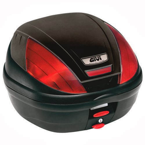
This is image shows one of the images I will be using on the Accessories page. This image represents a top box where motorcycle equipment or other items can be stored. The alternative text I will be using is: GIVI motorcycle top box in red and black.
This is image shows another image I will be using on the Accessories page. This image represents a sport full system exhaust to fit the latest model of the motorcycle. The alternative text I will be using is: Akrapovic full system sport exhaust.
This is image shows the third image I will be using on the Accessories page. This is a durable and reliable chain and padlock, which is used to improve the safeness of every motorcycle. The alternative text I will be using is: Mammoth 10mm Square lock and chain in light green cover.
This is another image I will be using on the Accessories page. This image represents rain/weather cover specifically designed for the dimensions of this motorcycle. The alternative text I will be using is: Grey Honda rain/weather motorcycle cover.

This is the last image I will be using on the Accessories page. It shows a paddock stand, which is used to perform various maintenance activities on the motorcycle. The alternative text I will be using is: Grey metal Paddock Stand specifically designed for the dimensions of this motorcycle.

Maintenance page


This is one of the images I will be using on the Maintenance page. It represents the changing of a motorcycle chain and sprockets. The alternative text I will be using is: Changing motorcycle chain and sprockets.


This image represents the changing of motorcycle engine oil. This is another basic maintenance done to every motorcycle. The alternative text I will be using is: Changing motorcycle engine oil.


This is the last image I will be using on the Maintenance page. It represents the checking of tyre pressure and pumping tyres. The alternative text I will be using is: Checking tyre pressure and pumping tyres.


Parts page

This is one of the images I will be using on the Parts page. It represents the clutch and front brake levers of the motorcycle. The alternative text I will be using is: Grey clutch and front brake levers.


This image represents the front brake disk. The alternative text I will be using is: Grey front brake disk.

This image represents the front brake pads for the motorcycle. The alternative text I will be using is: Dark grey and black material front brake pads.

This image represents a pair of mirrors to fit the motorcycle. The alternative text I will be using is: A pair of black standard motorcycle mirrors.


This is another image I will be using on the Parts page. It represents a pair of tyres to fit this motorcycle. The alternative text I will be using is: A pair of black tyres on grey rims/wheels.

This image shows a pair of replacement grips to fit this motorcycle. The alternative text I will be using is: A pair of black and red motorcycle grips.

This image shows brand new chain and sprockets kit. The alternative text I will be using is: Brand new grey chain and sprockets motorcycle kit.


This is the last image I will be using on the Parts page. It shows a standard rear shock absorber for the earlier models of the motorcycle. The alternative text I will be using is: Brand new grey and red early models motorcycle rear shock absorber.


Website Logo

This is the logo I've created for my website using Adobe Illustrator. I've taken ideas from different images as well as using my own imagination and creativity to develop a relevant and appropriate logo for the purpose of my website.

Website Interactivity

I'm planning on using some basic types of interactivity in my website.

One interactivity will be the buttons. The navigation buttons will get highlighted as the user hovers over them, in order to indicate a selection and give the user a better sense of navigation and orientation.

Furthermore, the logo will also have an interactivity. It will also be a button, which if clicked will be navigating the user to the home page. This interactivity will improve accessibility and navigation.

The last and final interactivity I will be using on my website is links. On both the Accessories and Parts pages, I will include a web address link on each image. This way the user will not only be aware of the products available, but actually visit websites they can purchase any of the products they want from. This may come very handy, in case they are not really up for searching for the products.